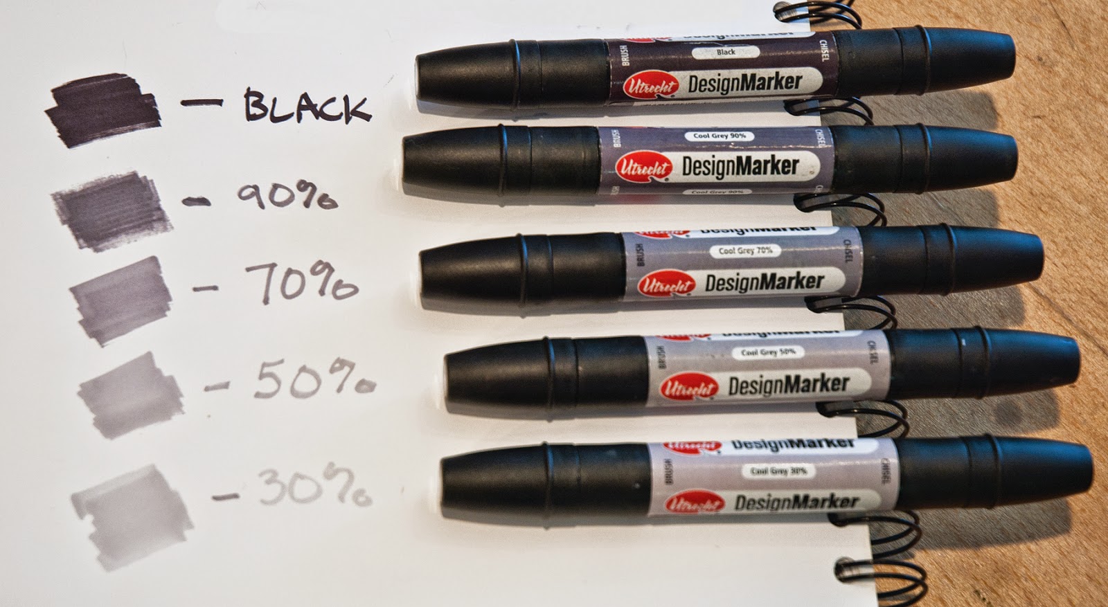
The problem with a pencil sketch is that the natural, broken line of a pencil doesn’t show true value. A more solid value study can be accomplished with design markers in various percentages of cool grays. For a 3 value study, I use black plus either 70% or 30% cool gray. Your choice can depend on the contrast you feel you will need in the painting and if the halftone will lean toward the light or the dark. Why lean one way or the other? In my previous post, I talked about using notans. When creating a notan, you must decide if your halftones lean toward light or dark because you are only using 2 values. The most effective halftone will carry out this idea. The 30% gray leans toward light. The 70% gray leans toward dark. For a 5 value study, use black plus 70%, 50%, and 30% cool gray.
 |
| I use Utrecht’s design markers. They have a fine tip on one end and a wide tip on the other. There are a variety of markers available, but be sure to get COOL GRAYS not warm grays. |
In these first 3 studies, the foreground is in shadow. The difference between these is the light pattern in the middle ground and background. Squint to look at these thumbnails and read the light patterns from top to bottom. Is the spacing pleasing or too symmetrical? Is it balanced? Which dominates - the light shapes or the dark shapes?
In this thumbnail, the background is entirely in shadow. Notice the pattern from top to bottom reads light, dark, light, dark. It is too evenly spaced.
This thumbnail has a light, dark, light, dark, light, dark pattern. Although the shapes aren’t equal, which makes it more pleasing, it’s too complicated.
This one has a light, dark, light, dark pattern but isn’t as even as the first so it works better.
Both of these thumbnails show the foreground in light. They both have a light, dark, light pattern. The one at the top is very evenly spaced and not as interesting as the one at the bottom in which the dark shape dominates.
In this final thumbnail (below), the foreground and middle ground are in shadow, with the background in light. This creates a very simple light, dark pattern. The dark shape dominates. Once transferred to a large canvas, it will be necessary to pull a few darks into the light area, as well as include a highlight or two in the dark area. These are details that can be worked out in larger scale. What’s important to remember is the large, simple shapes will make a strong design and that one value should dominate the others.
I've discussed using notans which flatten the design to only dark and light, and now value studies that include the halftones. Next week I'll talk about effective uses for the color study. Stay tuned!


Thank you for sharing! very helpful!
ReplyDeleteThis comment has been removed by the author.
ReplyDeleteUnfortunately, Dick Blick seems to be phasing out the Utrecht Design Markers as only the 10%, 30%, 50%, 90% cool grey and black are currently available on either companies web site. Both companies sites offer a 12 pack of Blick Studio Markers in cool grey, from 10% - 90% in 10% increments plus three blacks, which is more then is needed and (sadly) cannot be purchased individually. Regardless, thanks for the wonderful information.
ReplyDeleteI heard this from another artist as well, but thank you because I wasn't aware of this. I ordered a large quantity to take with me on workshops so all my students use them instead of pencils, and am still using the ones I ordered. I did check the Dick Blick website and it seems like the Prismacolor double-ended markers would be similar and they are similar in price, so I'm going to order some and see if they work.
ReplyDeletegood post Kim, think I'll steal this idea.
ReplyDelete