Thursday, February 26, 2015

The Value of Value Studies

Taking time on the front end to make several, quick value studies is an important part of the painting process.  Unlike a notan which simplifies and flattens everything in the image to either dark or light, a value study lets you develop halftones.  The most effective value studies have 3-5 values.  More than 5 will needlessly complicate your design, and therefore weaken the design.  For these small thumbnails, I use 3 values – white, black and one halftone.  Strong paintings have simple shape and value patterns.

During my time teaching, I have noticed a common mistake students make with their sketches.  They work up their study with pencil or a fine pen and end up with a sketch that has a lot of broken line such as the example below.


The problem with a pencil sketch is that the natural, broken line of a pencil doesn’t show true value.  A more solid value study can be accomplished with design markers in various percentages of cool grays.  For a 3 value study, I use black plus either 70% or 30% cool gray.  Your choice can depend on the contrast you feel you will need in the painting and if the halftone will lean toward the light or the dark.  Why lean one way or the other?  In my previous post, I talked about using notans.  When creating a notan, you must decide if your halftones lean toward light or dark because you are only using 2 values.  The most effective halftone will carry out this idea.  The 30% gray leans toward light.  The 70% gray leans toward dark.  For a 5 value study, use black plus 70%, 50%, and 30% cool gray.

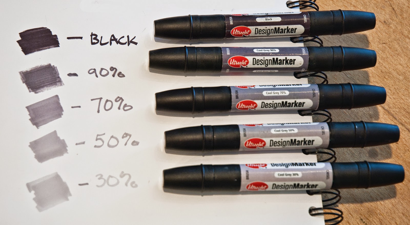
I use Utrecht’s design markers.  They have a fine tip on one end and a wide tip on the other.  There are a variety of markers available, but be sure to get COOL GRAYS not warm grays.

Each of the 7 value studies shown here have the same composition, but with the values placed differently.  In this example, I can quickly work through various ideas and decide which value study is the strongest.  The strongest one will become the design in which to base the painting. 


In these first 3 studies, the foreground is in shadow.   The difference between these is the light pattern in the middle ground and background.  Squint to look at these thumbnails and read the light patterns from top to bottom.  Is the spacing pleasing or too symmetrical?  Is it balanced?  Which dominates - the light shapes or the dark shapes?


In this thumbnail, the background is entirely in shadow.  Notice the pattern from top to bottom reads light, dark, light, dark.  It is too evenly spaced.


This thumbnail has a light, dark, light, dark, light, dark pattern.  Although the shapes aren’t equal, which makes it more pleasing, it’s too complicated.


This one has a light, dark, light, dark pattern but isn’t as even as the first so it works better.


Both of these thumbnails show the foreground in light.  They both have a light, dark, light pattern.  The one at the top is very evenly spaced and not as interesting as the one at the bottom in which the dark shape dominates.

In this final thumbnail (below), the foreground and middle ground are in shadow, with the background in light.  This creates a very simple light, dark pattern.  The dark shape dominates.  Once transferred to a large canvas, it will be necessary to pull a few darks into the light area, as well as include a highlight or two in the dark area.  These are details that can be worked out in larger scale.  What’s important to remember is the large, simple shapes will make a strong design and that one value should dominate the others.


I've discussed using notans which flatten the design to only dark and light, and now value studies that include the halftones.  Next week I'll talk about effective uses for the color study.  Stay tuned!

Thursday, February 19, 2015

Using Notan to Find Composition Problems


I have wanted to discuss notan for some time.  I should start with a basic explanation of notan and it's uses, but a recent problem with a studio painting has led me to jump ahead a bit and demonstrate one possible use of the notan.  

First a quick definition.  A notan is described as a combination of lights and darks especially as used in Japanese art, and the design of a work of art as seen in flat areas of light and dark only.  A proper notan shows the abstract shapes.  It finds the structure (like a skeleton of the painting).  Unlike a value study where the main concern is assigning value to shape, the notan helps inform you where the shapes and patterns should go.  Using it, you can decide if those middle values should contrast or blend in.

For this example I used a series of 2 value notans - dark value and light value.

I added lines to the photo to demonstrate where light patterns fall.
This painting was almost fully developed when that nagging feeling that something just wasn’t quite right came over me.  Now for the all important question - what is the problem?  Looking at it in different types of light didn’t make me feel any easier.  


Taking a photo and turning it to grayscale gave me a few indications, but when I changed it to black and white, I saw it.  The lighter value of the water in the creek was very close to centered in the composition, and it moved from top to bottom in a symmetrical way so there wasn't movement in the piece.  Not good.  Now what to do?

Here is an example of how using Notans can help solve the problem.  I quickly created several thumbnail notans in only two values - light (the paper) and dark (a black design marker).  Please remember that these shouldn't show any detail, only large, simple shapes.


The first is the notan as the painting looked when I discovered the problem.  Interesting that I viewed the mid values as closer to dark, but in reality they were closer to the light value so that the hill in the background disappears.


The second notan is trying to make the back hill darker.  This encloses the creek and creates a more stagnate composition.  Nope.


The third notan puts the back hill in the light value again, but this time closes off the foreground creating a more interesting shape in the creek.  A big improvement as now the dark value is clearly dominate over the light value and there is better movement.  Progress!


The fourth notan is just to make sure I have thought of all possibilities.  I close off the creek but this time also decide the back hill will be the dark value.  This was unsuccessful once, but now the creek shape is different so maybe….  No.  Number three is better.  I have that nagging feeling again.  That though this is an improvement, perhaps shifting the darks on the left side over closer to the edge would give the composition better balance.  Let’s see.


The fifth notan is similar to the third, only shifted to the left.  And it works.  It’s more dynamic.


Here is the finished piece:  "Reflected Light" 18x24.  The addition of rocks and the dark water in the foreground serve to connect the dark shape and makes the dark dominate over the light.  The light shape is more interesting.

I plan to discuss roles of notan vs. value study and how they both help composition in a future post, so please check back!

Thursday, February 12, 2015

Working Out Concepts

Lately I've been working out concepts instead of limiting myself to working from plein air paintings or photos. So what does that mean exactly?  First, let's define concept.  The Merriam-Webster dictionary defines concept as:  

1:  something conceived in the mind :  thought, notion

2:  an abstract or generic idea generalized from particular instances


Conceptual artwork has become to be known as work where the thought that went into it is of primary importance, and the creating of the work is not as important or even unimportant.  Whether this is an accurate definition of conceptual art is a discussion for another time.  The discussion I would like to have today is, how do you work through your creative concepts?  Do you stay true to the field study or the photograph because that is what you saw, do you adjust it to create a better composition, or do you go even further and play with ideas that are sparked from a field study or sketch?  I consider working conceptually as pulling ideas from multiple sources in order to create something new.


Here's an example that started with a cloud thumbnail out of my head.  My main objective was to create a cloud shape with movement.  There were 5 or 6 other thumbnail attempts that didn’t work as well.  This one had the right upward movement and side to side movement that filled the page nicely.

Left to right:  field study used for correct color, Cloud Dance Study 12x12, cloud thumbnail in sketchbook
So I had a thumbnail of a cloud that I really liked.  But it didn't come from a field study or a photograph, therefore I need some additional references to inform time of day, color, etc.  I also clearly need an adequate foreground.  After some searching, I found a plein air of a southwestern landscape and sky (shown on the left in the photo above) that I liked as a color example.  I believe the best reference to use for color is your field studies, especially if you are working conceptually.   I found a photo of a pond at sunset (not shown).  The pond photo wasn’t exactly like the pond in the study, but it was from the correct time of day.  In the middle of the easel you see the study I created from these three pieces.   


Cloud Dance Study, oil, 12x12

Here is the study simply titled, Cloud Dance Study, 12x12.  In order to decide what would be best in the foreground, I started with simple perspective lines that worked with the cloud design.  After that, I decided it would be a pond so I found a pond reference.  The perspective lines could have become several things, but in the end I decided that showing the reflection of the clouds at sunset would be the most dramatic and help continue the upward movement.  I decided on a square format because it accentuates the height, allowing vertical movement.


Cloud Dance, oil on linen, 30x30

After letting it sit for a few days, I determined it would indeed make a good larger piece and started a 30x30.  Working from a successful study gives an artist a certain amount of courage.  What has worked in this format should work again.  I have found that this confidence allows more freedom to play with the paint in a large piece.  Still, there will always be some unknowns when going larger.  In the case of Cloud Dance, the distance in the ground plane wasn't as developed in the study simply because there wasn't space to do so.  But in the 30x30 there was space, and it became necessary to develop and show depth in the ground plane from foreground to background.  I also felt like the larger, single tree in the study was at risk of taking over the focal point which is where the cloud touches the horizon.  In the 30x30, I put in another tree and made them smaller, thereby not allowing one to stand out.


The process of beginning with a thumbnail sketch, going to a small color study, and ending with a larger studio piece, has worked well for me.  It's a process I enjoy.  It may seem as though it takes more time on the front end, but the end result goes so much more smoothly than staring at a blank canvas and hoping for the best.  


There are many ways to work out creative concepts.  What are some ways you work out concepts?