Wednesday, April 12, 2017

Artist Outdoor Must-Haves, Part 1

We are getting some much needed rain and everything is quickly getting green.  Time to get out and paint!  I've had some time here and there to get out a little, and plan to get out more in spring and summer.  I'm teaching two plein air workshops in Kansas City and in Evergreen, CO this summer.  I'm also participating in the Telluride Plein Air Event, going up to Jackson, WY to paint, and hopefully squeezing in a paint trip at the end of summer (whewww!!).  To help get plein air ready, I've taken another look at my equipment and am sharing some thoughts on three tools I find very important when painting outdoors.  This may become a series as we artists can be passionate when it comes to our equipment.

Gamblin's Solvent-Free Gel
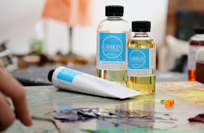


If you are on a paint trip and painting for days at a time, your paint can get tacky and hard to work with.  Or perhaps you are painting in cold weather and your paint has turned into putty.  Some medium may be necessary.  I used to have several of those little metal cups that clipped to my plein air palette so I could bring linseed oil, alkyds and other mediums along.  They get messy fast!  They fall off the palette.  I tried to put the medium directly on my palette to keep things simple.  Even bigger mess.  So then I just got mad and gave up using mediums outdoors.  Until I discovered Gamblin's Galkyd Gel.  Squeeze it out like paint right on the palette.  So easy!!  Now Gamblin has a Solvent-Free Gel version that works just as well.  Made from safflower oil and alkyd resin, Gamblin Solvent-Free Gel is non-toxic and contains no Gamsol or petroleum distillates.  What does this mean?  You can use the same medium in your studio without worry and take it outside for easy mixing.  It will thin in hot weather but so will your oils.  Gamblin recommends not using more than 25% by volume.  In other words, don't think of this as a glazing tool.  There are better mediums out there for glazing.  Gamblin's Solvent-Free Gel is the perfect all around medium if you are trying to keep things simple - and simple is always better outside!

PanelPak Panel Carriers


I'm not always hiking for 2 miles to get to that perfect painting spot, but when I do, this wet panel carrier is a must!  You can get two panels of the same size in each PanelPak.  Each one is only 3/4 inch thick and adds only 3/4 inch to each dimension.  I can take an 8x10 and a 9x12 one in my bag and add very little extra weight or dimension but still have 4 panels to paint in a day's hike!  One note:  you will need to carry two panels in each, even if you don't plan to paint on both.  They sit in the carrier facing each other which will help protect your painting when it's back in your bag.  Even if you're not planning to walk a great distance, these are still great for saving space in your backpack.  They are also great for traveling by air.  Have you ever tried to pack a wooden wet panel carrier in your carry on luggage?  Yikes!!  They come in a variety of sizes which you can find on their website:  http://www.panelpak.com/panelpaks.html.

Wax Paper and Saran Wrap


What? These two things are just laying around in my kitchen!  If you are on an extended trip or long workshop where you're painting several plein airs a day, that pile of panels is going to get big!  Wet panel carriers are still a must have, but you don't need carriers for all of your paintings.  I've come home with 20 plein airs from a trip.  That would be 10 PanelPaks.  With a little planning, you can select 2 or 3 sizes you'll use on the trip.  You'll need at least one carrier for each of those sizes.  Depending on where you travel and how thick you paint, your paintings could be dry to the touch in a few days.  Once they are dry to the touch, place a piece of wax paper that you've cut to size between paintings and stack them.  When you are done with the stack, use saran wrap to "shrink wrap" the stack so they stay in place.  It's important the wrapping is tight so there's no shifting during travel as shifting is what will mess up your paintings.  Once you get home, take it all apart.  Thicker paint that wasn't dry could flatten but you can make touch ups once you're home.  This is another great space saver if you are flying to your destination.

Wednesday, December 28, 2016

New for 2017 - Individual Lesson Plans!

Hello Artists,
I’m excited to let you know about new classes I’m going to start in 2017. Unlike the Online Mentoring Program where the classes were predesigned, these classes will be designed for you, based on your short term and long term goals. We start each week with a quick Skype chat about your goal for the week. Once your work is complete, you send digital images to me so I can review. Then, at a scheduled time, we’ll have a 20-30 min. discussion while you watch me work directly on your image! This way, you will have a before and after image of your painting. Both programs are $250 per month. The individual lessons can be on a month by month basis for a length of time of your choosing.

You can read about both programs on my website and then decide which would be best for you.
https://kimcasebeer.com/…/2017-online-mentoring-program-and…

Please don’t hesitate to contact me with any questions that you have. I’m excited about the opportunity to being able to work more directly with you!

Sunday, August 28, 2016

Small, Intensive Workshop just added for Oct. 5 and 6, 2016. 5 students maximum.

This workshop is set up as an intensive workshop for only 5 students so that each student can work on their goals for 1 1/2 days.

Skill level:  Intermediate drawing and painting knowledge.
Class size:  5
Medium:  Oil, Pastel, Acrylic
Hours on Wednesday 10/5:  5:30 pm - 8:00 pm
Hours on Thursday 10/6:  7:30 am - 3:30 pm
Tuition: $250 per person

To register, contact: 
Kim Casebeer at kimcasebeer@att.net or call 785-409-8949.  I will send out a Paypal invoice or you can pay by check.  The first 5 students to pay will have a spot in the class.

We meet at my home/studio: 3600 Ian Circle, Manhattan, KS  66503 on Wednesday night, and will decide where to meet Thursday morning.

Wednesday night we meet promptly at 5:30 in my studio to go over design, discover the importance of notans and value studies, and discuss color theory.  We will work on both value studies and color studies so bring a light plein air set up to the studio.

Thursday morning we will meet at 7:30 am, probably in one of the hotel parking lots in Blue Earth Place, 3rd and Colorado.  We will drive south out of town from there to get to our spot and set up by 8:00 am.   I will demo, then work with individuals at their easels until 12:30.  Meet back at my home/studio from 1-3:30 for wrap up and critique.  Pack a lunch to eat at painting location or back in my studio.

Sunday, August 21, 2016

Several Openings for September's Mentoring Class


I have several spots available for September's Online Mentoring Class.
This program will be limited to 12 students at a time.  
Free book, "Ideas for the Landscape Painter" included.
$250 Per Month /  Click to Receive the Course Outline or Sign Up

"I have just completed an online mentoring program with Kim Casebeer and I would highly recommend Kim as an accomplished artist and educator.  Her instruction methods are very easy to grasp and she is very informative in all areas of landscape painting.  After completing this workshop, I feel her direction has been invaluable, and feel this knowledge has greatly enhanced my own painting skills.  I was sorry to see this workshop come to an end!!" 
- Pamela Brickey

"Kim's mentoring program is the best thing I have done to help me grow as an artist. She is thorough with the process and videos, and generous of her time in giving critiques and feedback. I would recommend Kim as a teacher and mentor to anyone who wants to improve as an artist." 
- Beth Cole

Welcome to my mentoring program for landscape painters.  I’ve been teaching workshops for over 10 years.  During that time I have not only helped other artists learn how to improve their art, but I’ve also learned how to become a more effective teacher.  One of my biggest frustrations of teaching workshops is that after the workshop is over there are no guarantees that I will be able to keep in touch with each student to see how their work has improved and if they have been painting since the last workshop.  The only way to truly make a noticeable improvement in ones work is by painting on a regular basis.

That’s why I have decided to focus my teaching energy toward an online mentoring program this year.  These classes are set up as weekly, in-depth lessons that will make you a better painter by breaking down the process into smaller steps.  Instead of throwing everything at you at once because we only have 3 or 5 days, we focus each week on one aspect - line, values, composition, light, color, brush work, etc.  Yes a certain amount of patience is necessary.  But all of these steps are important.  They are what I believe in and they are what works.   Building upon what we’ve learned previously is what routine practice is all about.  Same for musicians, actors, and yes artists!

Other advantages of this online mentoring program is that you can work in your own studio and at your own pace.  There are also no travel expenses.  If you have taken a few workshops, you’ve probably already figured out that the travel expenses are often greater than the workshop itself.

So what can you expect each week?
•    A video demonstration for each lesson that will range from 1 hour up to 2.25 hours depending on topic.  These videos will be sent to you  
by email each Tuesday by 6pm CST, and can be downloaded to your computer so that you can refer to them when you’re ready.
•    A written explanation of the lesson plan that you can quickly refer to while practicing.
•    A personal critique of your artwork and weekly lesson with suggestions for improvement. Submit each completed lesson on the following
Tuesday by email.  The critique will be returned by email by Thursday at 9pm CST.
•    A full outline of the course’s lesson plans will be provided at the beginning of the program.  It will include lessons on line, composition,
value, temperature of color, intensity of color, brushwork and edges, creating atmosphere, types of light, and more.

Who can participate in the class?
You can participate in the class if you:
•    Have basic drawing and painting knowledge.  Even beginners can participate in this class as we will go through ideas step-by-step and   
it’s on an individual basis.
•    Work in oil, pastel, or acrylic media.
•    Can carve out a consistent amount of time during the week for painting.
•    Have an internet connection and computer capable of opening and playing lengthy videos.
•    Have an email program and address to send and receive images for critiquing.
•    Have a digital camera or smart phone capable of taking a photo at least 1200 pixels on the longest side (4 inches wide at 300 dpi).

How do you sign up?
The online mentoring program is paid for on a month to month basis.  The fee is $250.00 per month and includes weekly lessons and critiques.  You may start at the beginning of any month as long as there is room in the program.  All you need to do is send me an email or call indicating you would like to start and I will send you an invoice.  A Paypal invoice will be sent out by the 20th of the month and is due on the 1st of the following month.  You can pay through Paypal or by check.  You can end your mentoring program at any time.

Once you have paid for a month, the videos and lessons can be downloaded to your computer so they will always be available to you.  Each lesson is emailed to you by Tues. 6pm CST each week.  If you are out of town or can’t get to a computer for a few days, you will still have the lesson and can start it once you are ready.  Don’t worry, I will work with you to make sure you can stay on track!

“Kim provides a lot of information in her 18 week mentorship program.  Even though I have been painting for years, much of the information was new, or presented in such a cogent manner that it finally ‘clicked’ for me.  There are a lot of practices I can do over and over to continue to help me improve my skills.  The information and videos provide great insight into what it takes to become a better artist.  I highly recommend doing the mentorship with Kim!” – Bonnie Bowne

This program will be limited to 12 students at a time.
Free book, "Ideas for the Landscape Painter" included.

Tuesday, July 26, 2016

Why Is Transparent Orange On My Palette?

When teaching workshops, I often get asked why I have certain colors on my palette.  It's difficult to go into an in depth explanation during a demonstration!  So I've decided to dedicate several blog posts to some of the uniqueness of several of the oil colors I love and why I do.  I have to start with one of my favorites - Gamblin's Transparent Orange.

Anyone who has taken an oil painting workshop from me, has heard me gush about this beautiful color.  It's more typical to see Cadmium Orange on an oil painter's palette, but I traded Cadmium Orange in for it's more sophisticated cousin a while ago and haven't regretted it one bit!

Since we are visual people, I'm including some example color blocks one a color mixed with Transparent Orange compared to that same color mixed with something more commonly found on the palette.  In the more opaque colors the difference is harder to see, but look closely - it's there!

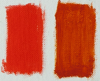
We will start with a color block of Transparent Orange and Titanium White, and Transparent Orange alone.

You can see how warm and radiant this color is when mixed with Titanium White.  I didn't make a similar block using Cadmium Orange, but if I had, you would see how much cooler Cadmium Orange is when compared to Transparent Orange.  And, just as the name and the color block on the right suggest, Transparent Orange is, well, transparent.  Cadmium Orange is opaque, as are all other Cadmiums. 


The next color block shows the difference between a Cadmium Orange/Lemon Yellow mix on the left, and a Transparent Orange/Lemon Yellow mix on the right.  Look closely and you can see that the block on the right is warmer and cleaner.  This is key to getting luminosity in skies.  Transparent Orange is my go to color to mix many of the colors in a glowing sunset.


The next color block shows what happens when a Viridian and Titanium White mixture is mixed with Lemon Yellow on the left, and with Transparent Orange on the right.  The left is a cooler green, but the right one has some warmth.  The warmer one is my preference when gradating skies.


Here is another example of warming up a green-blue for skies, this time using a Cobalt Blue and Titanium mixture and adding Lemon Yellow on the left, and Transparent Orange on the right.  Though I use both of these when gradating skies, experience tells me that the one with Transparent Orange on the right is grayed down just a little more than the left one.  This "grayed" blue-green has a more natural feel.


Here's a fun experiment:  the block on the left is Cadmium Red Light.  The block on the right is Alizarin Permanent and Transparent Orange mixed.  They are very close in temperature, but the Alizarin Permanent and Transparent Orange are both transparent colors that when mixed together have a nice, warm glow.  This mix can be useful to make warm greens, a warmer light value red when tinted with Titanium White, and many other uses.


The last two color block sets are greens.  One of my other favorite colors on my palette is Permanent Green Light.  This is an opaque, high chroma, green that is much too bright to use on it's own in a landscape.  However, when mixed with a red or orange, it becomes a beautiful, warm green good for early spring and summer greens.  The color block on the left is Permanent Green and Cadmium Orange, the one in the middle is Permanent Green and Cadmium Red Light, and the one on the right is Permanent Green and Transparent Orange.  Notice the one in the middle is slightly cooler, while the two on the ends (the oranges) are a little warmer.  The one on the right (Transparent Orange) is the cleanest.  Each have great uses - it just depends on what you need.


This last set of blocks is Viridian with Cadmium Orange on the left, Cadmium Red Light in the middle, and Transparent Orange on the right.  The Viridian and Cadmium Red Light mix in the middle is the darkest, coolest and "grayest."  The Cadmium Orange on the left warms up Viridian nicely but is more opaque.  The Transparent Orange and Viridian mixture on the right is the most transparent.  Again, each of these can be useful.  

I hope you've found this helpful, and that it may make you want to give Gamblin's Transparent Orange a try!  Most importantly, I hope you take away from this post that it's necessary to know the properties of the colors on your palette and what they will do when mixed with other colors. 
Don't take my word for it, experiment on your own!