When teaching workshops, I often get asked why I have certain colors on my palette. It's difficult to go into an in depth explanation during a demonstration! So I've decided to dedicate several blog posts to some of the uniqueness of several of the oil colors I love and why I do. I have to start with one of my favorites - Gamblin's Transparent Orange.
Anyone who has taken an oil painting workshop from me, has heard me gush about this beautiful color. It's more typical to see Cadmium Orange on an oil painter's palette, but I traded Cadmium Orange in for it's more sophisticated cousin a while ago and haven't regretted it one bit!
Since we are visual people, I'm including some example color blocks one a color mixed with Transparent Orange compared to that same color mixed with something more commonly found on the palette. In the more opaque colors the difference is harder to see, but look closely - it's there!
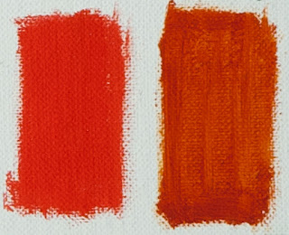
We will start with a color block of Transparent Orange and Titanium White, and Transparent Orange alone.
You can see how warm and radiant this color is when mixed with Titanium White. I didn't make a similar block using Cadmium Orange, but if I had, you would see how much cooler Cadmium Orange is when compared to Transparent Orange. And, just as the name and the color block on the right suggest, Transparent Orange is, well, transparent. Cadmium Orange is opaque, as are all other Cadmiums.
The next color block shows the difference between a Cadmium Orange/Lemon Yellow mix on the left, and a Transparent Orange/Lemon Yellow mix on the right. Look closely and you can see that the block on the right is warmer and cleaner. This is key to getting luminosity in skies. Transparent Orange is my go to color to mix many of the colors in a glowing sunset.
The next color block shows what happens when a Viridian and Titanium White mixture is mixed with Lemon Yellow on the left, and with Transparent Orange on the right. The left is a cooler green, but the right one has some warmth. The warmer one is my preference when gradating skies.
Here is another example of warming up a green-blue for skies, this time using a Cobalt Blue and Titanium mixture and adding Lemon Yellow on the left, and Transparent Orange on the right. Though I use both of these when gradating skies, experience tells me that the one with Transparent Orange on the right is grayed down just a little more than the left one. This "grayed" blue-green has a more natural feel.
Here's a fun experiment: the block on the left is Cadmium Red Light. The block on the right is Alizarin Permanent and Transparent Orange mixed. They are very close in temperature, but the Alizarin Permanent and Transparent Orange are both transparent colors that when mixed together have a nice, warm glow. This mix can be useful to make warm greens, a warmer light value red when tinted with Titanium White, and many other uses.
The last two color block sets are greens. One of my other favorite colors on my palette is Permanent Green Light. This is an opaque, high chroma, green that is much too bright to use on it's own in a landscape. However, when mixed with a red or orange, it becomes a beautiful, warm green good for early spring and summer greens. The color block on the left is Permanent Green and Cadmium Orange, the one in the middle is Permanent Green and Cadmium Red Light, and the one on the right is Permanent Green and Transparent Orange. Notice the one in the middle is slightly cooler, while the two on the ends (the oranges) are a little warmer. The one on the right (Transparent Orange) is the cleanest. Each have great uses - it just depends on what you need.
This last set of blocks is Viridian with Cadmium Orange on the left, Cadmium Red Light in the middle, and Transparent Orange on the right. The Viridian and Cadmium Red Light mix in the middle is the darkest, coolest and "grayest." The Cadmium Orange on the left warms up Viridian nicely but is more opaque. The Transparent Orange and Viridian mixture on the right is the most transparent. Again, each of these can be useful.
I hope you've found this helpful, and that it may make you want to give Gamblin's Transparent Orange a try! Most importantly, I hope you take away from this post that it's necessary to know the properties of the colors on your palette and what they will do when mixed with other colors.
Don't take my word for it, experiment on your own!
Don't take my word for it, experiment on your own!


No comments:
Post a Comment