Showing posts with label Studio Work. Show all posts

Wednesday, December 28, 2016

New for 2017 - Individual Lesson Plans!

Hello Artists,
I’m excited to let you know about new classes I’m going to start in 2017. Unlike the Online Mentoring Program where the classes were predesigned, these classes will be designed for you, based on your short term and long term goals. We start each week with a quick Skype chat about your goal for the week. Once your work is complete, you send digital images to me so I can review. Then, at a scheduled time, we’ll have a 20-30 min. discussion while you watch me work directly on your image! This way, you will have a before and after image of your painting. Both programs are $250 per month. The individual lessons can be on a month by month basis for a length of time of your choosing.

You can read about both programs on my website and then decide which would be best for you.
https://kimcasebeer.com/…/2017-online-mentoring-program-and…

Please don’t hesitate to contact me with any questions that you have. I’m excited about the opportunity to being able to work more directly with you!

Sunday, August 21, 2016

Several Openings for September's Mentoring Class


I have several spots available for September's Online Mentoring Class.
This program will be limited to 12 students at a time.  
Free book, "Ideas for the Landscape Painter" included.
$250 Per Month /  Click to Receive the Course Outline or Sign Up

"I have just completed an online mentoring program with Kim Casebeer and I would highly recommend Kim as an accomplished artist and educator.  Her instruction methods are very easy to grasp and she is very informative in all areas of landscape painting.  After completing this workshop, I feel her direction has been invaluable, and feel this knowledge has greatly enhanced my own painting skills.  I was sorry to see this workshop come to an end!!" 
- Pamela Brickey

"Kim's mentoring program is the best thing I have done to help me grow as an artist. She is thorough with the process and videos, and generous of her time in giving critiques and feedback. I would recommend Kim as a teacher and mentor to anyone who wants to improve as an artist." 
- Beth Cole

Welcome to my mentoring program for landscape painters.  I’ve been teaching workshops for over 10 years.  During that time I have not only helped other artists learn how to improve their art, but I’ve also learned how to become a more effective teacher.  One of my biggest frustrations of teaching workshops is that after the workshop is over there are no guarantees that I will be able to keep in touch with each student to see how their work has improved and if they have been painting since the last workshop.  The only way to truly make a noticeable improvement in ones work is by painting on a regular basis.

That’s why I have decided to focus my teaching energy toward an online mentoring program this year.  These classes are set up as weekly, in-depth lessons that will make you a better painter by breaking down the process into smaller steps.  Instead of throwing everything at you at once because we only have 3 or 5 days, we focus each week on one aspect - line, values, composition, light, color, brush work, etc.  Yes a certain amount of patience is necessary.  But all of these steps are important.  They are what I believe in and they are what works.   Building upon what we’ve learned previously is what routine practice is all about.  Same for musicians, actors, and yes artists!

Other advantages of this online mentoring program is that you can work in your own studio and at your own pace.  There are also no travel expenses.  If you have taken a few workshops, you’ve probably already figured out that the travel expenses are often greater than the workshop itself.

So what can you expect each week?
•    A video demonstration for each lesson that will range from 1 hour up to 2.25 hours depending on topic.  These videos will be sent to you  
by email each Tuesday by 6pm CST, and can be downloaded to your computer so that you can refer to them when you’re ready.
•    A written explanation of the lesson plan that you can quickly refer to while practicing.
•    A personal critique of your artwork and weekly lesson with suggestions for improvement. Submit each completed lesson on the following
Tuesday by email.  The critique will be returned by email by Thursday at 9pm CST.
•    A full outline of the course’s lesson plans will be provided at the beginning of the program.  It will include lessons on line, composition,
value, temperature of color, intensity of color, brushwork and edges, creating atmosphere, types of light, and more.

Who can participate in the class?
You can participate in the class if you:
•    Have basic drawing and painting knowledge.  Even beginners can participate in this class as we will go through ideas step-by-step and   
it’s on an individual basis.
•    Work in oil, pastel, or acrylic media.
•    Can carve out a consistent amount of time during the week for painting.
•    Have an internet connection and computer capable of opening and playing lengthy videos.
•    Have an email program and address to send and receive images for critiquing.
•    Have a digital camera or smart phone capable of taking a photo at least 1200 pixels on the longest side (4 inches wide at 300 dpi).

How do you sign up?
The online mentoring program is paid for on a month to month basis.  The fee is $250.00 per month and includes weekly lessons and critiques.  You may start at the beginning of any month as long as there is room in the program.  All you need to do is send me an email or call indicating you would like to start and I will send you an invoice.  A Paypal invoice will be sent out by the 20th of the month and is due on the 1st of the following month.  You can pay through Paypal or by check.  You can end your mentoring program at any time.

Once you have paid for a month, the videos and lessons can be downloaded to your computer so they will always be available to you.  Each lesson is emailed to you by Tues. 6pm CST each week.  If you are out of town or can’t get to a computer for a few days, you will still have the lesson and can start it once you are ready.  Don’t worry, I will work with you to make sure you can stay on track!

“Kim provides a lot of information in her 18 week mentorship program.  Even though I have been painting for years, much of the information was new, or presented in such a cogent manner that it finally ‘clicked’ for me.  There are a lot of practices I can do over and over to continue to help me improve my skills.  The information and videos provide great insight into what it takes to become a better artist.  I highly recommend doing the mentorship with Kim!” – Bonnie Bowne

This program will be limited to 12 students at a time.
Free book, "Ideas for the Landscape Painter" included.

Monday, February 22, 2016

Going Through the Painting Process, Studio Work

I get asked (a lot) if I always start a painting with a value study.  I won't lie - no not always.  When I'm outside, I quickly get caught up in the excitement of capturing a scene en plein air and get started.  If you have a smart phone, you can jump start this process by taking a photo, then changing it to grayscale.  This can quickly help you discover any issues the potential composition will have.  Yes that's right, it will almost always have something that won't work.  Seeing the composition in grayscale will help you see correct values.

But when I'm in my studio, I always start with a value study.  This is because I have the luxury of time in my studio.  There is time to look at the potential composition and work out any problems it may have.  There is time to decide on proportions and if the piece should lean toward light values or darker values.  The goal in my studio is usually to work toward creating a larger piece, therefore the process becomes more important.  When outside, I'm in the moment of discovery - this is part of the process.  Therefore the outdoor painting is treated as a study.

A value sketch to get the process started.

Let me walk you through the studio painting process.  As mentioned, first I start with at least several value studies, sometimes notans as well.  These monochromatic sketches are often substituted for one another, but they are two different things.  A notan is only black and white - no gray values.  It's an abstract way to look at your composition as either in light or in shadow.  A value sketch has varying values of gray that accurately represent the values seen in your reference material.  I will always do several value sketches.  If I'm uncertain if a painting should lean toward light or dark, or I want to see the abstract design in a composition, I will create some notans.

Pillsbury Snow Study, oil, 6x8   ©Kim Casebeer
After the monochromatic sketches are complete, I will make a color study.  The size of the study will depend on the desired size of the finished painting.  It may also depend on how much I'm changing things around in the design compared to my photo or plein air references.  If a lot is going to change and I'm unsure of how it will all come together, I'll do a small color study first.  This is typically 6x8 or similar.  If that works, and I think the final piece will be large, I will often create one more color study, perhaps twice the size of the first one.

I'm in the process of working on this snow scene of a local landmark called Pillsbury Crossing.  The crossing is where the bottom of Deep Creek becomes a solid rock bed, capable of being driven across.  There is a lot of overgrown brush along the creek.  I wanted to see if I could simplify it by opening it up, as well as giving it a heavy snow fall to cover more of the rocks.  We haven't had a heavy snow this year so making it up is necessary!  To try this out, I started with a 6x8 color study (after the value sketch).  I felt like it worked and could potentially be a large piece.  But I also know from experience that what works in a 6x8 doesn't always translate to, say 24x30.  I decided to double it, going to a 12x16 color study.  You can see the reference photo plus the two color studies in the image below.

The 6x8 color study, the 12x16 color study, and the reference photo in the bottom left.

I adjusted the rock shapes in the foreground, added a few more loose rocks in the water, broke up the snow banks a little more, and pushed the warm highlights a little more.  There are a few more adjustments I need to make now that I've let the 12x16 sit for a few days.  Overall, I feel like it will be successful larger.  I feel confident in doubling the size once more - to 24x30 or so.  I just made a new, alkyd primed, linen board and am ready to get started.  We'll see where this adventure leads!

Sunday, July 26, 2015

Painting Lively Clouds Demonstration for Lori McNee and North Light Books

A New Book by Lori McNee and North Light Books

I'm very pleased to let you know about a new book written by Lori McNee and published by North Light Books.  Fine Art Tips shares demonstrations, techniques and advice from 24 artists, including myself.  I share a step-by-step demonstration on painting lively clouds.  My painting, Summer Renewal, is featured on the cover of the book!

This book is available on the North Light Book website.


Summer Renewal, oil, 30x40.  Featured on the cover of Fine Art Tips and heading to a gallery shortly.


Thursday, April 9, 2015

New Book Just Published

Hello painters and collectors!  I have just self-published a little book full of information.  "Ideas for the Landscape Painter:  Taking Your Work from Concept to Completion and Beyond," is a 9" x 7" softcover book in full color with 80 pages.  It is a compilation of information I have gathered through experience, teaching, networking with other artists, and with those in the art business. It is packed with what I hope will be valuable tools, such as:

Information about the tools and materials I use to paint with both oil and soft pastel, and why using quality materials is important.


Why spending time planning your design in the beginning can save you time through the process. Plus samples and explanations on the difference between notan and value study, and how to effectively use each of these tools.


A discussion on color theory, and why questioning the intensity of a color is more important than whether that color is warm or cool.  Color didn’t fully make sense until I understood this!


Where to set up and what to take when painting outdoors.


Idea starters for getting the creative process going!


Plus more information about evaluating your work, varnishing, preparing to ship work, and creating a stand out portfolio.


This book will sell for $19.95.  You can mail a check, but I will have Paypal set up on my website soon to make the ordering process easier.  I'm getting ready to leave for the Plein Air Convention and will set it up after I return.


Thursday, February 26, 2015

The Value of Value Studies

Taking time on the front end to make several, quick value studies is an important part of the painting process.  Unlike a notan which simplifies and flattens everything in the image to either dark or light, a value study lets you develop halftones.  The most effective value studies have 3-5 values.  More than 5 will needlessly complicate your design, and therefore weaken the design.  For these small thumbnails, I use 3 values – white, black and one halftone.  Strong paintings have simple shape and value patterns.

During my time teaching, I have noticed a common mistake students make with their sketches.  They work up their study with pencil or a fine pen and end up with a sketch that has a lot of broken line such as the example below.


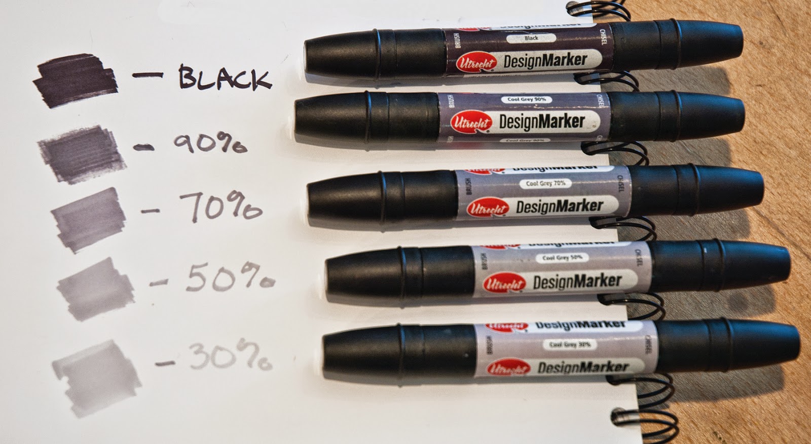
The problem with a pencil sketch is that the natural, broken line of a pencil doesn’t show true value.  A more solid value study can be accomplished with design markers in various percentages of cool grays.  For a 3 value study, I use black plus either 70% or 30% cool gray.  Your choice can depend on the contrast you feel you will need in the painting and if the halftone will lean toward the light or the dark.  Why lean one way or the other?  In my previous post, I talked about using notans.  When creating a notan, you must decide if your halftones lean toward light or dark because you are only using 2 values.  The most effective halftone will carry out this idea.  The 30% gray leans toward light.  The 70% gray leans toward dark.  For a 5 value study, use black plus 70%, 50%, and 30% cool gray.

I use Utrecht’s design markers.  They have a fine tip on one end and a wide tip on the other.  There are a variety of markers available, but be sure to get COOL GRAYS not warm grays.

Each of the 7 value studies shown here have the same composition, but with the values placed differently.  In this example, I can quickly work through various ideas and decide which value study is the strongest.  The strongest one will become the design in which to base the painting. 


In these first 3 studies, the foreground is in shadow.   The difference between these is the light pattern in the middle ground and background.  Squint to look at these thumbnails and read the light patterns from top to bottom.  Is the spacing pleasing or too symmetrical?  Is it balanced?  Which dominates - the light shapes or the dark shapes?


In this thumbnail, the background is entirely in shadow.  Notice the pattern from top to bottom reads light, dark, light, dark.  It is too evenly spaced.


This thumbnail has a light, dark, light, dark, light, dark pattern.  Although the shapes aren’t equal, which makes it more pleasing, it’s too complicated.


This one has a light, dark, light, dark pattern but isn’t as even as the first so it works better.


Both of these thumbnails show the foreground in light.  They both have a light, dark, light pattern.  The one at the top is very evenly spaced and not as interesting as the one at the bottom in which the dark shape dominates.

In this final thumbnail (below), the foreground and middle ground are in shadow, with the background in light.  This creates a very simple light, dark pattern.  The dark shape dominates.  Once transferred to a large canvas, it will be necessary to pull a few darks into the light area, as well as include a highlight or two in the dark area.  These are details that can be worked out in larger scale.  What’s important to remember is the large, simple shapes will make a strong design and that one value should dominate the others.


I've discussed using notans which flatten the design to only dark and light, and now value studies that include the halftones.  Next week I'll talk about effective uses for the color study.  Stay tuned!

Thursday, February 19, 2015

Using Notan to Find Composition Problems


I have wanted to discuss notan for some time.  I should start with a basic explanation of notan and it's uses, but a recent problem with a studio painting has led me to jump ahead a bit and demonstrate one possible use of the notan.  

First a quick definition.  A notan is described as a combination of lights and darks especially as used in Japanese art, and the design of a work of art as seen in flat areas of light and dark only.  A proper notan shows the abstract shapes.  It finds the structure (like a skeleton of the painting).  Unlike a value study where the main concern is assigning value to shape, the notan helps inform you where the shapes and patterns should go.  Using it, you can decide if those middle values should contrast or blend in.

For this example I used a series of 2 value notans - dark value and light value.

I added lines to the photo to demonstrate where light patterns fall.
This painting was almost fully developed when that nagging feeling that something just wasn’t quite right came over me.  Now for the all important question - what is the problem?  Looking at it in different types of light didn’t make me feel any easier.  


Taking a photo and turning it to grayscale gave me a few indications, but when I changed it to black and white, I saw it.  The lighter value of the water in the creek was very close to centered in the composition, and it moved from top to bottom in a symmetrical way so there wasn't movement in the piece.  Not good.  Now what to do?

Here is an example of how using Notans can help solve the problem.  I quickly created several thumbnail notans in only two values - light (the paper) and dark (a black design marker).  Please remember that these shouldn't show any detail, only large, simple shapes.


The first is the notan as the painting looked when I discovered the problem.  Interesting that I viewed the mid values as closer to dark, but in reality they were closer to the light value so that the hill in the background disappears.


The second notan is trying to make the back hill darker.  This encloses the creek and creates a more stagnate composition.  Nope.


The third notan puts the back hill in the light value again, but this time closes off the foreground creating a more interesting shape in the creek.  A big improvement as now the dark value is clearly dominate over the light value and there is better movement.  Progress!


The fourth notan is just to make sure I have thought of all possibilities.  I close off the creek but this time also decide the back hill will be the dark value.  This was unsuccessful once, but now the creek shape is different so maybe….  No.  Number three is better.  I have that nagging feeling again.  That though this is an improvement, perhaps shifting the darks on the left side over closer to the edge would give the composition better balance.  Let’s see.


The fifth notan is similar to the third, only shifted to the left.  And it works.  It’s more dynamic.


Here is the finished piece:  "Reflected Light" 18x24.  The addition of rocks and the dark water in the foreground serve to connect the dark shape and makes the dark dominate over the light.  The light shape is more interesting.

I plan to discuss roles of notan vs. value study and how they both help composition in a future post, so please check back!

Thursday, February 12, 2015

Working Out Concepts

Lately I've been working out concepts instead of limiting myself to working from plein air paintings or photos. So what does that mean exactly?  First, let's define concept.  The Merriam-Webster dictionary defines concept as:  

1:  something conceived in the mind :  thought, notion

2:  an abstract or generic idea generalized from particular instances


Conceptual artwork has become to be known as work where the thought that went into it is of primary importance, and the creating of the work is not as important or even unimportant.  Whether this is an accurate definition of conceptual art is a discussion for another time.  The discussion I would like to have today is, how do you work through your creative concepts?  Do you stay true to the field study or the photograph because that is what you saw, do you adjust it to create a better composition, or do you go even further and play with ideas that are sparked from a field study or sketch?  I consider working conceptually as pulling ideas from multiple sources in order to create something new.


Here's an example that started with a cloud thumbnail out of my head.  My main objective was to create a cloud shape with movement.  There were 5 or 6 other thumbnail attempts that didn’t work as well.  This one had the right upward movement and side to side movement that filled the page nicely.

Left to right:  field study used for correct color, Cloud Dance Study 12x12, cloud thumbnail in sketchbook
So I had a thumbnail of a cloud that I really liked.  But it didn't come from a field study or a photograph, therefore I need some additional references to inform time of day, color, etc.  I also clearly need an adequate foreground.  After some searching, I found a plein air of a southwestern landscape and sky (shown on the left in the photo above) that I liked as a color example.  I believe the best reference to use for color is your field studies, especially if you are working conceptually.   I found a photo of a pond at sunset (not shown).  The pond photo wasn’t exactly like the pond in the study, but it was from the correct time of day.  In the middle of the easel you see the study I created from these three pieces.   


Cloud Dance Study, oil, 12x12

Here is the study simply titled, Cloud Dance Study, 12x12.  In order to decide what would be best in the foreground, I started with simple perspective lines that worked with the cloud design.  After that, I decided it would be a pond so I found a pond reference.  The perspective lines could have become several things, but in the end I decided that showing the reflection of the clouds at sunset would be the most dramatic and help continue the upward movement.  I decided on a square format because it accentuates the height, allowing vertical movement.


Cloud Dance, oil on linen, 30x30

After letting it sit for a few days, I determined it would indeed make a good larger piece and started a 30x30.  Working from a successful study gives an artist a certain amount of courage.  What has worked in this format should work again.  I have found that this confidence allows more freedom to play with the paint in a large piece.  Still, there will always be some unknowns when going larger.  In the case of Cloud Dance, the distance in the ground plane wasn't as developed in the study simply because there wasn't space to do so.  But in the 30x30 there was space, and it became necessary to develop and show depth in the ground plane from foreground to background.  I also felt like the larger, single tree in the study was at risk of taking over the focal point which is where the cloud touches the horizon.  In the 30x30, I put in another tree and made them smaller, thereby not allowing one to stand out.


The process of beginning with a thumbnail sketch, going to a small color study, and ending with a larger studio piece, has worked well for me.  It's a process I enjoy.  It may seem as though it takes more time on the front end, but the end result goes so much more smoothly than staring at a blank canvas and hoping for the best.  


There are many ways to work out creative concepts.  What are some ways you work out concepts?

Monday, September 29, 2014

"Fall Unfolding Study" Little Gem Auction for Crop Hunger Walk - Final Auction

"Fall Unfolding Study"  oil  12z10

"Fall Unfolding Study" is the third and final (yes final!) piece up for auction, with 100% of the winning bid going toward the Crop Hunger Walk.  This is the study for a recently completed 50x40 studio piece.  I spent the weekend giving a workshop in the flint hills.  The grasses are beautiful and the trees are starting to turn shades of gold.  In a few weeks we will see it unfold!

All proceeds will go toward the Crop Hunger Walk in Manhattan, KS, which I am walking October 5th.   The Crop Hunger Walk's goal is to end hunger, and has raised more than $294 million in the last 20 years.  I have fond memories of participating in this walk when I was in high school and am excited about doing it again.

It's easy to add this little gem to your collection while donating to the Crop Hunger Walk.

How to Bid:
- Minimum bid begins at $75- yep, that's it!
- Bidding increments of $25.
- No reserve price. Winning bid gets the painting, which is unframed.
- Just bid in the comment section below.
- The auction ends on Tuesday, Sept. 30 at 11pm - Central Standard Time.
- I will contact the winning bidder who can pay by check or Paypal with 100% of proceeds going to the Crop Hunger Walk.  I can post the donation to my Crop Hunger Walk page or it can remain anonymous.

This is your chance to support a great cause and get a little gem of a painting so bid high and bid often!  Good luck!  I hope you get the painting.

Wednesday, March 5, 2014

My Color Palette for Studio and Plein Air

This is a revision of an older post from 2012 where I discuss my palette.  I've added WHY I use particular colors.  I recently announced my 2014 workshops, and since there are a lot of questions about color palette before and during workshops, I decided to update this and repost.


Here is my color palette in the studio.

"What colors are on your palette?" is a common question asked during workshops or demos.  This is my studio palette, laid out on a 20x30 piece of glass with a mid-tone gray board placed under the glass to aid in value comparisons.  My current palette consists of the following Gamblin colors, laid out in this order at the top from left to right:  Cadmium Yellow Lemon, Cadmium Yellow Deep, Yellow Ochre, Transparent Orange Mixture, Cadmium Orange (sometimes), Cadmium Red Light, Alizarin Permanent, Burnt Sienna, and Asphaltum.  Then on the left side of the palette, from bottom to top: Ultramarine Blue, Cobalt Blue, Viridian, Permanent Green Light, Cadmium Green, and occasionally Sap Green (not shown).  Titanium White is in the top left corner between these two.

I would consider this a modified prismatic palette.  It goes through the warm colors from lightest to darkest along the top, then through the cool colors on the left - from the coolest to the warmest.  Aside from having a range of warms and cools, I am also trying to give myself a range of values. 

I will quickly go through this palette to explain why I chose each:
Cad Yellow Lemon - This is the lightest, coolest yellow.
Cad Yellow Deep - This is a darker, warmer yellow that gives good value range between yellows.
Yellow Ochre - This is a good earth yellow and important in depicting drier climates.
Transparent Orange Mixture - A rich, transparent, warm orange.  Warms up greens beautifully and makes nice green blues for the sky without making it appear too green.
Cad Orange - This is a cooler intense orange.  If I have to choose, I prefer Transparent Orange.
Cad Red Light - This is a warm red and the lighter value.
Alizarin Permanent - This is the cooler, darker red that gives good value range between reds.
Burnt Sienna - An indispensable earth red with decent tinting strength.
Asphaltum - A transparent, dark, yellow earth that grays cool colors nicely.
Ultramarine Blue - This is the cooler, darker value blue that gives good value range between blues.
Cobalt - This is the warmer, lighter value blue with more intensity.
Viridian - A dark, cool green that will tint warm but still look clean with orange, or go grayer with reds.
Permanent Green Light - This is also a cool green with a lot of intensity.  It needs to be toned but once mixing is mastered it has a lot of possibility.
Cad Green - An intense, warm, light green good for new foilage mixtures.
Sap Green - This is an earthy green sometimes good for dark mixes but it can also dull colors and get you in trouble.
Titanium White - A high tinting strength white that's good for landscape painting because it takes less to tint than other whites.  It is a cool white so as you mix it into your color, your mixture will also need to be warmed.

No matter how you lay out your palette, the most important thing to remember is to be consistent! Reaching for colors in the same place each time helps streamline the mixing process.

Here is my slightly simplified plein air palette.

If I am painting outdoors, my typical studio palette is simplified because of space constraints and to make painting more direct in the field.  I lay it out the same, that is all the warm colors across the top and cool colors on the left side with Titanium White in the upper left corner between them.  Top: Cadmium Yellow Lemon, Cadmium Yellow Deep, Yellow Ochre, Transparent Orange Mixture, Cadmium Red Light, Alizarin Permanent, and Burnt Sienna.  Then on the left side of the palette, from bottom to top: Ultramarine, Cobalt Blue, Viridian, Permanent Green Light.

I have experimented with a limited palette and believe this to be a useful tool for beginning students who may not have a good handle on color mixing.  If you are interested in using a limited palette, I would encourage you to experiment with several versions of a red, yellow, blue palette to see what works best for you.  You will want to give yourself a large value range, so I would suggest Cad. Yellow Lemon or Cad. Yellow Light for your yellow, Alizarin Permanent or Cad. Red for your red (Cad Red Lt is too warm and light for a limited palette), and Ultramarine Blue plus Titanium White.  Another good addition to this would be an earth tone such as burnt sienna. Be sure to have dark values on your limited palette because you can always tint lighter with Titanium.

My palette has been adjusted throughout my painting career.  Most of my palette is Gamblin because they make great paint and they have a wealth of useful information on their website about color properties.  I've been wanting to conduct a brand comparison for a while but life got very busy with a move the last six or more months.  I've been planning how to do this and hope to get it started soon.

Wednesday, July 11, 2012

New Paintings Available at Legacy Gallery, Jackson, Wyoming

As some of you know by now, Galleries West in Jackson, Wyoming has closed.  My paintings have been well represented by this gallery since the summer of 2005.  Debbie Bunch and Scott Nickell were wonderful to work with and this is unfortunate, but they are looking forward to a new chapter in their lives and I wish them all the best.

Visiting and painting this beautiful part of our country has become a highlight for me.  I am happy to continue this tradition and to announce that my artwork will now be available at Legacy Gallery in Jackson, Wyoming.  Legacy Gallery is located at 75 North Cache, on the corner of Deloney Ave. and Cache.  They have been providing fine art to collectors for over 20 years.  Below, please find images of work currently available at Legacy.  I am very excited about this new work, some of which will be included in a fine art book titled Art of the National Parks, to be published early 2013.  I welcome any comments or questions you have regarding this new work.  You may also contact Legacy Gallery at 307-733-2353 or visit their website: www.legacygallery.com.  Their website has photos of these three pieces framed.

Thank you for taking an interest in my work and I hope you have a wonderful summer!

Autumn, Schwabacher Landing, oil on linen, 24x36.  Available at Legacy Gallery.

Fall in the Valley, oil on linen, 18x24.  Available at Legacy Gallery.

Mount Moran from Willow Flats, oil on linen, 20x24.  Available at Legacy Gallery.

Tuesday, July 3, 2012

America the Beautiful 4th of July Show

Hueys Fine Art will host the "America the Beautiful - 4th of July Show" this month.  This piece, Flint Road, an oil painting on linen measuring 24x36, is included in the show.  As artists it is sometimes difficult to detach and truly know if a piece is strong.  For me, this piece is successful on many levels.  First, it is inspired by a scene only 10 minutes from my studio and home.  A place I know well and paint a lot.  The atmosphere lent a tonal palette on this particular trip out.  It immediately reminded me of one of my favorite paintings by Isaak Levitan, Vladimirka.  While painting the larger piece in my studio, it was hard not to think of Levitan, so Flint Road is also a tribute of sorts to him.

To see this painting and the other beautiful pieces available during this show, visit www.hueysfineart.com.  The opening reception is this Friday, July 6 from 5-7pm.

Flint Road, oil on linen, 24x36

Sunday, June 3, 2012

"Art of the National Parks," Fine Art Book to be Published

I am thrilled to announce that, for the first time, my work will be included in a fine art book titled Art of the National Parks, published by Fresco Fine Art Publications, early 2013.  There will be ten National Parks featured.  My artwork will be featured in the Yellowstone/Grand Teton National Park section, along with 8-10 other artists I greatly admire including Clyde Aspevig, Ralph Oberg, Jim Wilcox, Carole Cooke and Scott Christensen. The book is co-authored and curated by Jean Stern, executive director of the Irvine Museum in California, and Susan McGarry, former editor of Southwest Art magazine and current director of the Plein Air Painters of America.  It will be sold through Barnes & Noble, Amazon, and national museums among others.  There will also be a group exhibit for the participating artists in proximity to the Parks either summer or fall of 2013 once the book is published.

This is such a great opportunity and I want to share it with all of you!  I will spend the third week of June traveling to Jackson Hole, Wyoming to paint the Grand Teton and Yellowstone National Parks for this book project, and will be posting updates on my blog while traveling and painting so you can see the process as well as the finished pieces.  I have already created and posted some studio work from last fall's trip to Wyoming that may be included in the book. (See Grand Teton/Yellowstone National Parks Painting Series)

Please check back under the Art of the National Parks Book label for posts about this new adventure!


Friday, June 1, 2012

There are still a few spots available in the Improving Studio Work Through Plein Air workshop held at the Art League in New Braunfels, TX June 8-10.  Please check the workshop page on this blog or my website for more information. We will have fun, learn a lot, and don't worry, we WILL stay cool!

Tuesday, May 29, 2012

Grand Teton/Yellowstone National Parks Painting Series

I have been hard at work on a new series of paintings that I am very excited about and wanted to share a few of them with you.  These pieces focus on both the Grand Teton and Yellowstone National Parks in the northwestern portion of Wyoming.  These are all studio pieces based on plein air pieces created during a trip to the Grand Teton National Park last September.  I will be adding to this series as I complete work so please check back.

This first piece, A Haven for Many, is a fork of the Snake River which runs through the Grand Teton National Park.  This is Schwabacher Landing, a popular spot to view the Tetons.  As the title suggests, these types of environments are home to many birds, fish, and other wildlife.
A Haven for Many, oil, 18x24

Bradley Lake Shoreline, is a view of Garnet Canyon across Bradley Lake.  Bradley Lake is a short hike from Taggart Lake along Taggart Lake trail.  I have hiked this trail many times and painted along both the Taggart Lake and the Bradley Lake shorelines.
Bradley Lake Shoreline, oil, 24x24
Fall in the Valley, is a beautiful view of the valley from Willow Flats Overlook in Grand Teton National Park.  The light was wonderful on this particular fall evening.
Fall in the Valley, oil, 18x24

This piece, Mount Moran from Willow Flats, is the same evening in the Willow Flats Overlook area, looking across a portion of Jackson Lake to Mount Moran.  I have painted en plein air in the Willow Flats area many times.

Mount Moran from Willow Flats, oil, 20x24
 The Magic Hour, is an intimate view of the Snake River shoreline in the Grand Teton National Park.  The evening light was just, well magical!
The Magic Hour, oil, 24x18

Friday, February 24, 2012

Light is the Master

Here are a few studio pieces that I recently completed.  Though they are over a thousand miles apart, they have one strong commonality.  Both are fairly ordinary subjects that have been transformed by light and atmosphere.

This first one, "Flint Road," is a 24x36 oil painting of an area just a few minutes west of my home.  It's amazing how light can affect a person's perception of a place.  I drive along this road a lot, and have seen it look very ordinary.  But doing some land snorkeling on a day when the clouds were moving along at a pretty good clip, I was lucky enough to catch many photos of cloud shadows raking across the land.  A few plein air pieces looking another direction, and a couple sketches of this view, and I couldn't get back to the studio fast enough! (I will post the plein air pieces soon.)

Flint Road, oil, 24x36
This piece, "Rain Glow," was painted in the studio after a trip to the Jackson Hole, Wyoming area.  I was there in September, painting with my good friend and fellow artist, Cally Krallman.  We spent several hours painting the mountain views along Spring Gulch Road.  Even though the sun went behind a thick haze and there was already mist in the air, we decided to try for one more piece down the road where we found this intimate little pond.  We were just getting warmed up when the rain came pouring down and we had to abandon the spot.  My plein air piece was pretty much destroyed by the large rain drops, but I did manage to shoot some photos of the sun trying to peak out of the fog before the heavy rain hit.  Back in the studio, I used my photos, my half completed plein air, and my memory to finish.